Students
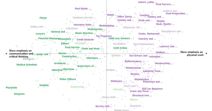
1. This graph, which originally appeared in The New York Times, shows more than 500 jobs, their required skills and how likely they are to be automatable. You can enter a job in the “Find a job …” field to find where it is on the graph. You can also hover the cursor over a job title to find more information. On March 21, we will provide additional background about the graph as well as relevant statistical concepts.
After looking closely at the graph above, think about these three questions:
• What do you notice?
• What do you wonder?
What are you curious about that comes from what you notice in the graph?
• What might be going on in this graph?
Write a catchy headline that captures the graph’s main idea. If your headline makes a claim, tell us what you noticed that supports your claim.
The questions are intended to build on one another, so try to answer them in order. Start with “I notice,” then “I wonder,” and end with “The story this graph is telling is ….” and a catchy headline.
2. Next, join the conversation by clicking on the comment button and posting in the box that opens on the right. (Students 13 and older are invited to comment, although teachers of younger students are welcome to post what their students have to say or they can have their students use this same activity on Desmos.)
3. After you have posted, read what others have said, then respond to someone else by posting a comment. Use the “Reply” button or the @ symbol to address that student directly.
On Wednesday, March 20, our collaborator, the American Statistical Association, will facilitate this discussion from 9 a.m. to 2 p.m. Eastern Time to help students’ understanding go deeper. You might use their responses as models for your own.
4. On the afternoon of Thursday, March 21, we will reveal more information about the graph at the bottom of this post. Students, we encourage you to post an additional comment after reading the reveal. How does the original New York Times article and the moderators’ comments help you see the graph differently? Try to incorporate the statistical terms defined in the Stat Nuggets in your response.
_________
More?
• Read our introductory post, which includes information about using the “Notice and Wonder” teaching strategy.
• Learn about how and why other teachers are using this feature, and use the 2018-19 “What’s Going On in This Graph?” calendar to plan ahead for the 25 Wednesday releases.
• Go to the A.S.A. K-12 website, which includes This is Statistics, resources, professional development, student competitions, curriculum, courses and careers.


