

What is the secret to a growing blog? While there isn’t a single magic rule for success, the traps that hurt your growth are almost always the same. To keep your site on the right track, avoid these 4 common blogging mistakes:
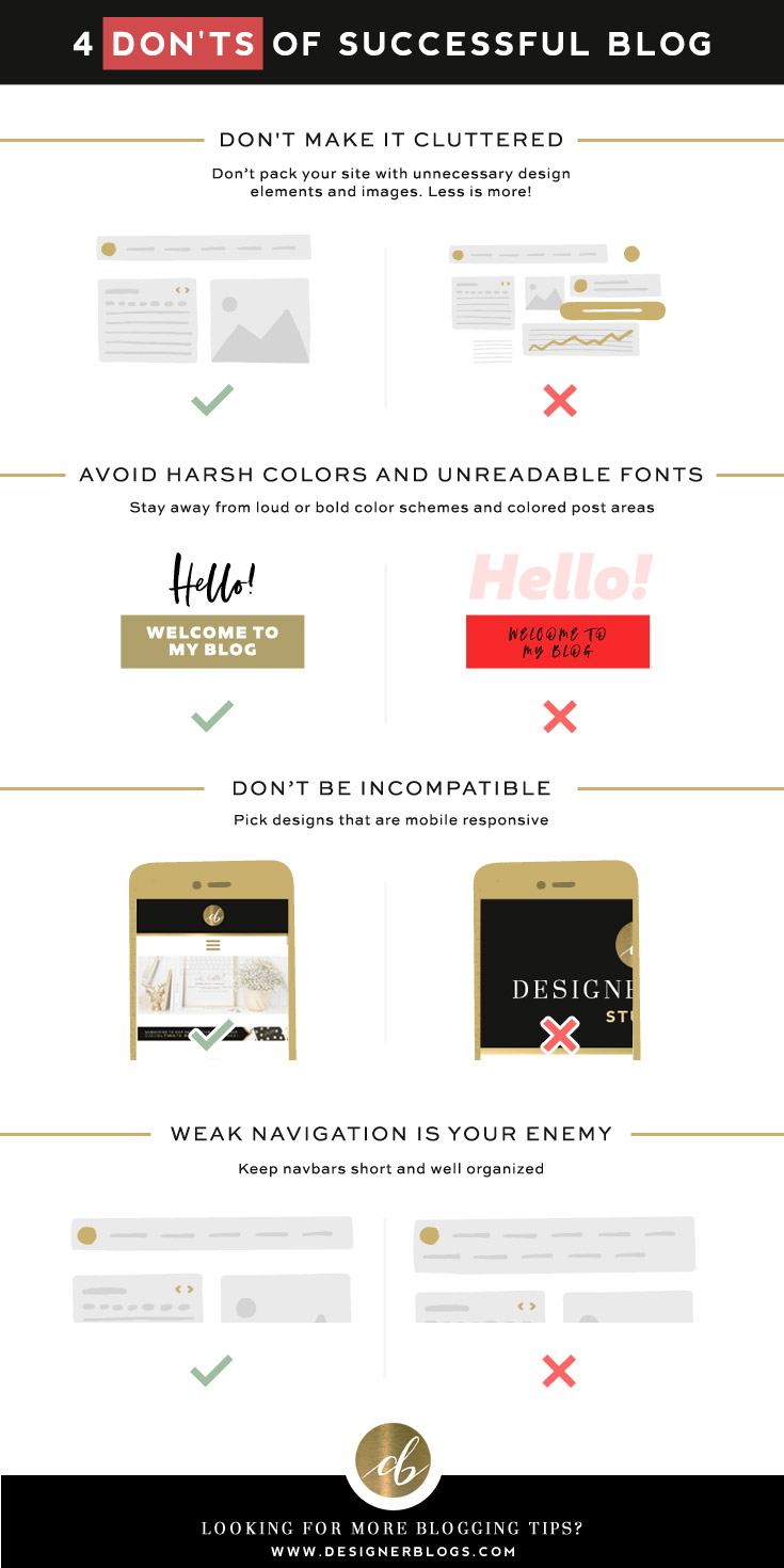
1. Don’t Clutter Your Layout
When it comes to web design, less is more. Packing your site with heavy design elements and endless widgets slows down your load time. If your site takes too long to load, visitors will leave before reading a single word.
The Fix: Keep important content at the top. Clear out the digital noise so your actual writing can shine.
Related Post: The Ultimate Foundation: 10 Essentials Every Blogger Needs
2. Don’t Use Harsh Colors or Unreadable Fonts
Loud color schemes and colored post backgrounds quickly strain the eyes. The same goes for typography: fancy script fonts might look great in a logo, but they make body text impossible to read.
The Fix: Stick to clean, classic fonts for your posts. If a visitor can’t read your content comfortably for five minutes straight, it’s time to change the design.
To give you some idea about not so good colors and fonts combinations below you will find a text written in two fonts – Opulent and Geometrica.

Even thou both sides are using the same fonts, text on the left is much easier to read. Using too light fonts, too dark background for darker fonts or capitalized script fonts is usually a bad idea if you are not experienced in design.
If you need some inspiration, check out our Typography Section for tried-and-true font pairings!
3. Don’t Ignore Mobile Compatibility
In the modern digital landscape, mobile responsiveness isn’t a luxury – it’s a necessity. The vast majority of web traffic now comes from smartphones and tablets. If a reader clicks your link from social media and your site looks broken or cut off on their phone, they will hit the back button instantly.

Regularly check your new posts on your own phone to see how they format.
The Fix: Ensure your blog theme is fully mobile-responsive. (Note: All of our premade and custom themes are built to look flawless on every screen size!)

4. Don’t Overcomplicate Your Navigation
Your audience should understand what your site is about within seconds. If they have to hunt for your categories or contact page, they will give up. However, giving them too many menu buttons causes “decision paralysis.”
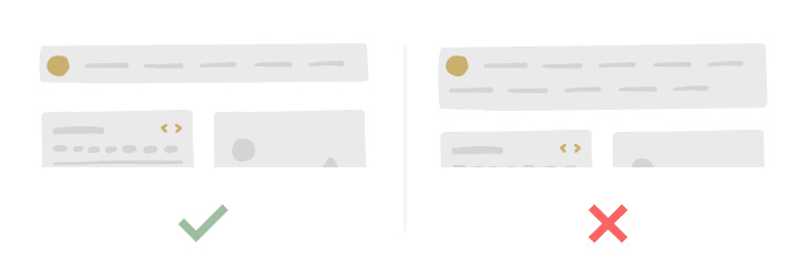
The Fix: Use clean navbars and limit your main menu to a maximum of 7 buttons. Keep it to a single horizontal line on desktop screens.
Related Post: SEO for People Who Hate SEO: The Power of Better Linking
Do you have a successful blog?
Share your experiences in the comments below! For more design and blogging strategies, check out our tutorial database.
Love this post? Pin the graphic below to your Pinterest board for later!