fbpx
Home Blog Page 1293

Join us for Codecademy Live: Linear Regression in Python

0
Join us for Codecademy Live: Linear Regression in Python

Linear regression is a fundamental machine learning algorithm used for predictive modeling and data analysis. Learn more about it as Curriculum Developers Alex and Sophie guide you through our new course: Linear Regression in Python.

In the latest addition to our Codecademy Live series, our Curriculum Developers will teach you the fundamentals of linear regression and its various applications. Linear regression is a  technique for modeling quantitative outcomes using any number of predictors. For example, you could use it to understand the relationship between a person’s income and other attributes such as education level and years of experience.

Learning about linear regression will prepare you to explore other kinds of machine learning models and enable you to read and understand research papers in just about any field of study!

Along with the walkthrough, Sophie and Alex will also be hosting 30-minute office hour sessions every Thursday between May 20th and June 3rd (and possibly longer — we’ll keep you posted). Open to all learners, the office hours are a great opportunity to connect with the developers behind some of your favorite courses and ask any questions not answered during the stream.

How to watch

The live sessions will be streamed every Tuesday at 11am EDT from May 18th to July 13th (except July 7th) on YouTube, Twitch, Twitter, and Facebook. We’ll be focused on the live chat on YouTube, so join us there if you want to be part of the conversation in real time.

Each session will last for about an hour, but don’t worry if you can’t make it — they’ll all be recorded so you can watch them later at your convenience. For more details, check out the Codecademy Events page.

What we’ll cover

Our Curriculum Developers will guide you through our free Linear Regression in Python course.

First, we’ll introduce you to simple linear regression and show you how to implement it in Python with both quantitative and categorical predictors. Then, we’ll move on to multiple linear regression and walk through some of the math behind the model before covering tools used to improve and build more flexible models, such as interactions, polynomial terms, and data pre-processing. Finally, we’ll discuss ways of comparing a few different models in order to choose the “best” one. The last session will walk through the entire workflow with some real (and more messy!) data.

Below, you’ll find detailed descriptions of each session.

Session #1: Introduction to simple linear regression

May 18th, 2021 at 11am EST | ADD TO CALENDAR

In this session, we’ll introduce the concept of simple linear regression and learn how to implement it in Python. Linear regression is a machine learning technique that’s used to predict and analyze quantitative outcomes, such as salary, time spent on a website, or adult height. In the process, we’ll review algebra and graphing skills and learn about concepts that are applicable to many different machine learning algorithms.

Session #2: Categorical predictors

May 25th, 2021 at 11am EST | ADD TO CALENDAR

In this session, we’ll demonstrate how to include a categorical predictor with two or more categories in a simple linear model. For example, we’ll learn how to predict the price of a New York City apartment based on the borough where it is located. This will help us build our intuition for how to create and interpret more complex linear models.

Session #3: Introduction to multiple linear regression

June 1st, 2021 at 11am EST | ADD TO CALENDAR

In this session, we’ll build our first linear model with more than one predictor. As an example, we’ll use simulated data from a math class to predict student quiz performance based on hours of studying, number of completed assignments, and whether or not the student ate breakfast.

Session #4: The matrix representation of the linear regression problem

June 8th, 2021 at 11am EST | ADD TO CALENDAR

In this session, we’ll dig into some of the math behind multiple linear regression. While there are a number of Python modules that allow us to fit a model without understanding this math, it is difficult to troubleshoot, interpret, and learn new technologies without it. This session will give you enough understanding to accomplish these things while still bypassing detailed algebra and calculus!

Session #5: Interactions and polynomial terms

June 15th, 2021 at 11am EST | ADD TO CALENDAR

In this session, we’ll learn about some useful tools for modeling non-linear relationships using linear regression. This will allow us to build more flexible models, representing real-life relationships that cannot be summarized with a straight line.

Session #6: Data transformations

June 22nd, 2021 at 11am EST | ADD TO CALENDAR

In this session, we’ll learn about data pre-processing that is useful prior to fitting a linear regression model. These kinds of transformations are potentially helpful when the assumptions of linear regression are otherwise violated. Pre-processing can also make the regression output more interpretable and therefore easier to communicate to a non-technical audience.

Session #7: Comparing and choosing a linear regression model

June 29th, 2021 at 11am EST | ADD TO CALENDAR

In this session, we’ll discuss ways of comparing possible regression models and choosing the “best” one for prediction or analysis. In different business and research settings, the word “best” might mean different things. For example, if you need to be able to explain your model to a broad audience, you may want to prioritize interpretability over small gains in accuracy. By the end of this session, you’ll understand some of the most common methods for choosing a model.

Session #8: Linear regression workflow

July 13th, 2021 at 11am EST | ADD TO CALENDAR

In this session, we’ll walk through the full process of pre-processing some data, fitting a few different linear models, choosing the “best” one, interpreting the results, and using our model to make predictions for new data. We hope this session inspires you to build your own linear regression model to solve a problem that interests you!


What Is the Best Way to Get Teenagers Vaccinated?

0
What Is the Best Way to Get Teenagers Vaccinated?

Students in U.S. high schools can get free digital access to The New York Times until Sept. 1, 2021.

On Monday, the Food and Drug Administration authorized the Pfizer-BioNTech vaccine for children ages 12 to 15 in the United States, a crucial step in the nation’s recovery from the pandemic and a boon to millions of American families eager for a return to normalcy.

The shots may also allow millions to get back to school, camps, Little League games, sleepovers and hangouts with friends.

What is your reaction to the news? Are you eager to get vaccinated? Or do you and your family have concerns about the newly available drug?

In “To Vaccinate Younger Teens, States and Cities Look to Schools, Camps, Even Beaches,” Abby Goodnough and Jan Hoffman write about the implications of the F.D.A.’s approval of the coronavirus vaccine for younger adolescents:

“The game changes when you go down as young as 12 years old,” said Nathan Quesnel, the superintendent of schools in East Hartford, Conn., adding, “You need to have a different level of sensitivity.”

A recent survey by the Kaiser Family Foundation’s Vaccine Monitor found that many parents — even some who eagerly got their own Covid shots — are reluctant to vaccinate pubescent children. Yet doing so will be critical for further reducing transmission of the virus, smoothly reopening middle and high schools and regaining some sense of national normalcy.

Vaccination for the age group is expected to begin across the country later this week. Sites are anticipating an initial surge in demand before an inevitable softening, much as happened with adults.

States, counties and school districts around the country are trying to figure out the most reassuring and expedient ways to reach younger adolescents as well as their parents, whose consent is usually required by state law. They are making plans to offer vaccines not only in schools, but also at pediatricians’ offices, day camps, parks and even beaches.

Children’s Minnesota, a Minneapolis-based hospital system where the main Covid vaccination site has offered stress balls, colored lights and images of playful dolphins projected on the ceiling, is planning to provide shots beginning later this week in at least a dozen middle schools and a Y.W.C.A.

In Columbus, Ohio, public health nurses will drive a mobile vaccination unit around neighborhoods “just like you would an ice cream truck,” said Dr. Mysheika Roberts, the city health commissioner. In Connecticut, Community Health Center, a statewide primary care provider that vaccinated the busloads of high school seniors, is aiming to reach younger adolescents by offering shots at amusement parks, beaches and camps, among other locales.

The article describes some of the vaccination challenges and concerns regarding younger adolescents:

Many parents and teenagers have been stirred by false information coursing across the internet about the shots’ impact on fertility and menstrual cycles, said Dr. Hina Talib, an adolescent medicine specialist at the Children’s Hospital at Montefiore in the Bronx, who posts on Instagram as @teenhealthdoc.

“With hormones floating around during puberty, parents ask if it’s dangerous for their child to be given a vaccine during that time,” Dr. Talib said. The questions reflect the parents’ thoughtfulness, she said, and need to be addressed respectfully.

Dr. Talib, whose patients are often Black or Latino and recent immigrants, said that many hear vaccine resistance at home. “We have to validate parental anxiety and mistrust of medicine and be very open to listening to what their experiences have been,” she said.

Garrett Bates and Precious Wright, who live in Hollywood, Fla., have tentatively decided to get themselves vaccinated, but they are holding off on their four children, ages 12 through 19, just now.

It has been a tough year: Two of the children attended school in person, two were remote. Yet, even though vaccination offers the possibility that all their children will have a more engaged, carefree life, Ms. Wright wants to see how others their age fare first.

Ms. Goodnough and Ms. Hoffman explore different approaches and messages to persuade teenagers who are reluctant to get the shot:

Not all teenagers long for the vaccine. Many hate getting shots. Others say that because young people often get milder cases of Covid, why risk a new vaccine?

Patsy Stinchfield, a nurse practitioner who oversees vaccination for Children’s Minnesota, has stark evidence that some cases in young people can be serious. Not only have more children with Covid been admitted to the hospital recently, but its intensive care unit also has Covid patients who are 13, 15, 16 and 17 years old.

The F.D.A.’s new authorization means all those patients would be eligible for the shots, she noted. “If you can prevent your child ending up in the I.C.U. with a safe vaccine, why wouldn’t you?” she said.

Mr. Quesnel, the East Hartford, Conn., superintendent, said the most powerful message for reaching older adolescents would probably appeal just as much to younger ones. Rather than focusing on the fact that the shot will protect them, he said, they seize on the idea that it will keep them from having to quarantine if they are exposed.

“They’re not so afraid of the health care dangers from Covid but the social losses that come along with it,” he said, adding that 60 percent of his district’s seniors, or about 300 students, got their first dose at a mass vaccination site run by Community Health Center on April 26. “Some of our greatest leverage right now is that social component — ‘You won’t be quarantined.’”

Students, read the entire article, then tell us:

  • What is your reaction to the F.D.A.’s approval of the Covid vaccine for 12- to 15-year-olds? Do you hope to get vaccinated? Why or why not? If you have already received the vaccine, what were your reasons for doing so and what was your experience like?

  • The authors write, “For some teenagers, anxious about bringing the virus home to vulnerable relatives, the vaccine represents liberation — from those worries as well as constraints on seeing friends.” Does that resonate with your experiences of the pandemic? What would getting a vaccine mean to you?

  • The article reports that many parents are “reluctant to vaccinate pubescent children.” Have you discussed the possibility of your getting vaccinated with your parents? Does your family have similar concerns or fears to those of the parents discussed in the article? Do you think you and your family are on the same page regarding vaccines?

  • Some states, counties and school districts are planning to offer vaccines not only in schools, but also at pediatricians’ offices, day camps, parks and even beaches. What do you think are the best ways to reassure and reach adolescents as well as their parents? How effective are enticements like vaccination sites with stress balls, colored lights and images of playful dolphins projected on the ceiling? What other creative ideas for outreach would you recommend to local public health and political leaders?

  • All 50 states require certain vaccines for children who attend school. Do you think schools should require students 12 and older to have the Covid vaccine to attend in person? Why or why not?

  • What do you think is the best way to get teenagers vaccinated? Imagine you were asked by local officials to design a public health campaign to persuade teenagers to get the coronavirus vaccination. What would be your approach? What would be your message or slogan? How might you address the fears and concerns of your peers and their parents? What evidence or persuasive techniques might you use? How would you communicate your message — posters, public service announcements or TikTok videos? Why?

The Math of Ending the Pandemic: Exponential Growth and Decay

0
The Math of Ending the Pandemic: Exponential Growth and Decay

Students in U.S. high schools can get free digital access to The New York Times until Sept. 1, 2021.

Featured article: “The Math That Explains the End of the Pandemic”

When the coronavirus came to the United States over a year ago, we developed a new mantra: “Flatten the curve.” The goal was to stem the runaway exponential growth in infections, in that way preventing hospitals from becoming overrun.

With the development and uptake of highly effective Covid-19 vaccines, we are now beginning to see the mathematical cousin of exponential growth — exponential decay — take over Covid case trends. According to experts, this is welcome news. If all goes well, current trends may foreshadow the end of the pandemic.

In this lesson, you will use the mathematical concepts of exponential growth and exponential decay to explain the spread and slowdown of the coronavirus. Then, you will use these models to explore different end-of-pandemic scenarios and the potential to reach herd immunity.

This tree diagram shows a potential coronavirus chain of transmission. Each dot represents an infected person. One infected person (the person at the top of the diagram) spreads the coronavirus to others, who then spread it to others and so on.

After looking closely at the graph above (or at this full-size image), answer these four questions. The questions are intended to build on one another, so try to answer them in order:

To understand exponential growth, let’s take a mathematical look at the tree diagram — using the table below.

The tree diagram can help us model the number of new infections over time. Specifically, let’s define each horizontal layer of dots as representing the number of new infections on a certain day.

The top layer, representing Day 0, depicts just one newly infected person (one dot). The next layer down, representing Day 1, depicts two newly infected people (two dots). The following layer, representing Day 2, depicts four newly infected people (four dots). Here’s a visual that shows how we are defining the days:

We can begin to fill in our chart with the number of new infections each day, based on the number of dots within these first few days:

Go ahead and fill in the rest of the table, based on the diagram. Note: You may notice a pattern, which can save you a lot of time from counting!

Answer the following questions, about the diagram and the table:

  • Fill in the blank with a number: In the diagram, each newly infected person spreads the disease to ___ new people the next day. Hint: How many lines come out from each dot?

  • Look at the table. What mathematical pattern do you notice?

  • Let’s connect our prior observations. Explain how the infection patterns we see in the tree diagram give rise to the mathematical pattern we see in the table.

Repeated multiplication creates what we call exponential patterns. If you’ve learned about exponents before, this name should make some sense. Exponents represent repeated multiplication. For example:

When we repeatedly multiply by a number greater than 1, we observe exponential growth. To get a sense of what exponential growth looks like, we’re going to visualize our table of values as a graph.

Treat the days as the x values and the number of new infections as the y values. Each horizontal row on the table represents a data value (an x-y coordinate pair). Graph these data values on the following x-y coordinate grid. After you graph the points, connect them using a curved line (not a straight line). Note: The first point is already graphed for you.

Respond to the following:

  • Describe what happens to the number of new infections over time.

  • Describe what happens to the rate of new infections over time.

  • Hospitals have limited capacity and bed space. Using this graph, discuss why it was so important in the early stages of the pandemic to follow social distancing guidelines and “flatten the curve.”

One way to test the quality of a mathematical model is to compare it to available data. Below is a graphic of the world’s coronavirus case count early in the pandemic (March 2020), using data from Our World in Data. In addition to the raw data (the black dots), we’ve fit an exponential growth mathematical model (the blue line).

  • Do you believe an exponential growth model is appropriate for modeling the initial spread of Covid-19? Justify using the graphics above.

  • The statistician George E. P. Box famously said, “All models are wrong, but some are useful.” Look at the model and the data. The model is not an exact fit to the data. Why do you think this is the case? Is the model still useful?

Read the featured article from the beginning through the following paragraph:

Every case of Covid-19 that is prevented cuts off transmission chains, which prevents many more cases down the line. That means the same precautions that reduce transmission enough to cause a big drop in case numbers when cases are high translate into a smaller decline when cases are low. And those changes add up over time. For example, reducing 1,000 cases by half each day would mean a reduction of 500 cases on Day 1 and 125 cases on Day 3 but only 31 cases on Day 5.

As people become vaccinated, they are less likely to catch and show symptoms of the virus. Think about the tree diagram from earlier. The vaccine effectively blocks severe infection pathways from person to person (it breaks the lines between dots). As more people are vaccinated, more pathways are blocked, and the spread of the virus begins to slow.

How much can the spread slow? The author poses an example in which the number of cases reduces by half each day. Mathematically, this can be written as:

Number of cases tomorrow = 0.5 * (Number of cases today)

Let’s create a table of values. Start out with the following:

To find the number of active cases on Day 1, we can follow the formula and multiply the Day 0 total by 0.5. This is shown below:

Go ahead and continue the pattern to fill in the rest of the table. You may get decimal answers for some days. At each day, round your answer to the nearest whole number, before proceeding to the next day.

Again, we see repeated multiplication. This means we have another exponential pattern. However, because we are multiplying by a number less than 1, we now have exponential decay. The article visualizes exponential decay using this graphic:

Answer the following questions:

  • In the table of values, how much did the number of cases fall from Day 0 to Day 1? How much did the number of cases fall from Day 5 to Day 6? Comment on any trend you notice.

  • Think about the trend you mentioned above. Does the graph show a similar trend? Explain.

  • The article says that “the worst of the pandemic may be over sooner than you think.” Assume people continue to get vaccinated and follow public health guidelines. Why does the exponential decay model indicate that the worst will be over “sooner” than we think? Why wouldn’t we have to wait awhile for the worst to pass?

As before, we can evaluate the quality of our model by comparing it to real data. Continue reading the article through the following paragraph:

This pattern has already emerged in the United States: It took only 22 days for daily cases to fall 100,000 from the Jan. 8 peak of around 250,000, but more than three times as long for daily cases to fall another 100,000.

Here is a graph from The New York Times’s Covid-19 database that illustrates this trend (focus on January 2021 and onward):

Answer the following questions:

  • The article says that case counts fell by 100,000 in 22 days. Afterward, it took three times as long for the cases to decline by another 100,000. Explain how this statement supports the exponential decay model.

Continue reading the article until you reach the following graphic:

This graph displays an important concept in statistics and the sciences: counterfactuals. Whenever you think to yourself, “I wonder what would happen if …” — you’re essentially constructing a counterfactual. A counterfactual is an alternate reality that would exist if you changed something about your world.

In the above case, the dashed line provides a counterfactual Covid-19 case scenario. In this counterfactual reality, we relax public health precautions “too soon” and break the exponential decay trend.

  • Imagine a counterfactual in which we started relaxing restrictions at an even earlier time, just as the cases began to trend downward. Would we see a larger or smaller gap between the solid line and the counterfactual? Why?

Option 1: Exponential decay in some countries. Exponential growth in others.

Use the Learning Network lesson on the recent surge of coronavirus cases in India. Connect the lesson to this visualization (from Our World in Data) of Covid-19 case trends in both India and the United States. Where do you see exponential decay? Where do you see exponential growth? What makes case trends differ between countries?

Option 2: Will we reach herd immunity?

Read the article “Reaching ‘Herd Immunity’ Is Unlikely in the U.S., Experts Now Believe.” Reflect on the following questions: What does herd immunity have to do with exponential growth and decay? What would need to happen to reach herd immunity? What factors affect our ability to reach herd immunity? Why are some experts still hopeful, even if we don’t quite reach herd immunity? You can also explore the topic visually with this “What’s Going On in This Graph?” activity.

Option 3: Explore the math of vaccine efficacy.

Use the Learning Network lesson on calculating vaccine efficacy with data from the main Pfizer trial. As you work through the lesson, you will use math, statistics and probability to get a practical sense of how the vaccine performed. (Spoiler: It did well.)

Option 4: Analyze vaccine hesitancy.

Explore the New York Times vaccination database to analyze vaccination rates in your community. Then, use this Learning Network lesson to learn about vaccine hesitancy and efforts to persuade vaccine skeptics.

This lesson was written by Dashiell Young-Saver, who is a high school statistics teacher and the founder of the site Skew The Script. Important contributions were made by Sharon Hessney, who writes the NYT Learning Network’s weekly feature “What’s Going On in This Graph?”


About Lesson of the Day

• Find all our Lessons of the Day in this column.
• Teachers, watch our on-demand webinar to learn how to use this feature in your classroom.

Lesson of the Day: ‘‘‘Belonging Is Stronger Than Facts”: The Age of Misinformation’

0
Lesson of the Day: ‘‘‘Belonging Is Stronger Than Facts”: The Age of Misinformation’

Students in U.S. high schools can get free digital access to The New York Times until Sept. 1, 2021.

Featured Article: “‘Belonging Is Stronger Than Facts’: The Age of Misinformation” by Max Fisher

Have you been told to think twice before sharing articles or political memes on social media? Or to use media literacy skills to fact-check articles before sharing them? While these tools are important, recent research has indicated that social media is not the only reason that misinformation spreads so quickly and viciously.

In this lesson, you will learn about a new study that shows the power of social and psychological factors in the spread of misinformation. Then you will see if you live in a political bubble and consider if that might contribute to the spread of misinformation where you live. Or you will participate in a citizen science project designed to fight misinformation.

Read the first paragraph of the featured article:

There’s a decent chance you’ve had at least one of these rumors, all false, relayed to you as fact recently: that President Biden plans to force Americans to eat less meat; that Virginia is eliminating advanced math in schools to advance racial equality; and that border officials are mass-purchasing copies of Vice President Kamala Harris’s book to hand out to refugee children.

  • Had you heard any of the above rumors before reading the article? Do you remember where you heard it or who told you? Did you believe them? Why or why not?

  • Are there any other rumors that you’ve read online or heard friends talking about? How did you know they were false?

  • How concerned are you about misinformation online? Why?

Read the article, then answer the following questions:

1. Why does Brendan Nyhan, a Dartmouth College political scientist, believe that misinformation persists despite widespread access to good information?

2. Describe “ingrouping” in your own words. What is one example of ingrouping causing misinformation from the last year or two?

3. How have greater partisan divisions created hostility between the two political parties? What is an example of misinformation caused by social and political distrust and polarization?

4. In what ways can high-profile political figures contribute to misinformation? Share an example of a political leader who created, or encouraged supporters to believe, misinformation.

5. How does the psychological effect of “social reward” create a dynamic in which misinformation is spread using social media?

6. What is your reaction to the following paragraph from the article?

“We have found that Twitter users tend to retweet to show approval, argue, gain attention and entertain,” researcher Jon-Patrick Allem wrote last year, summarizing a study he had co-authored. “Truthfulness of a post or accuracy of a claim was not an identified motivation for retweeting.”

When you share something on social media, how much time, if any, do you spend verifying the accuracy before sharing? What steps do you take to verify the information?

7. What are the dangers of this culture of misinformation?

One of the themes explored in the featured article is the power of feeling you’re part of an “ingroup” and the experience of a separate “nefarious outgroup.” The article says that one of the biggest causes for misinformation currently may be the “rise in social polarization.”

How relevant do you think social polarization is in your community? Do you feel as though you live in an area where people generally have the same political beliefs? Or do you feel you’re an outlier, politically, where you live?

To see how similar or different your community is politically, spend some time looking at the first section of the article “Do You Live in a Political Bubble?” Start by entering your home or school address to see the political party of the thousand voters closest to you. Then look closely at the bubble generated by the interactive: What do you notice and wonder about the political beliefs in your neighborhood?

Scroll down to see a map of the political demographics in a nearby community. How similar or different are they from where you live? What factors do you believe contribute to these demographics?

Now return to the questions above: How much of a role do you believe social polarization plays in your community? Do you think that the political bubble you live in contributes to the spread of misinformation in your area? Why or why not?

If you are 16 years or older, you can participate in Public Editor, a citizen science project, where you will be asked to label misleading or inadequately supported information in news articles. To participate you will need to use a Google Chrome browser, create a free account and watch a three-minute video about how the system works. Then you will be asked to evaluate a sentence from an article for its bias, and support your evaluation with evidence from the passage.

Spend 10 to 15 minutes on the project. Then reflect on this question asked by Discover magazine in response to the Public Editor project, “Can citizen science help fight misinformation and biased news coverage?” After participating in the experiment, what do you think? Did you feel that you were helping to combat misinformation through your assignments?

Do you think more people should participate in Project Editor and other similar citizen science projects to fight misinformation? Or do you think there are more effective ways to address this issue?


About Lesson of the Day

• Find all our Lessons of the Day in this column.
• Teachers, watch our on-demand webinar to learn how to use this feature in your classroom.

Word of the Day: incentive

0
Word of the Day: incentive

1. a positive motivational influence

2. an additional payment (or other remuneration) to employees as a means of increasing output

_________

The word incentive has appeared in 551 articles on NYTimes.com in the past year, including on April 16 in “Why Amazon Workers Sided With the Company Over a Union” by Karen Weise and Noam Scheiber:

Mr. Brooks is one of almost 1,800 employees who handed Amazon a runaway victory in the company’s hardest-fought battle to keep unions out of its warehouses. The result — announced last week, with 738 workers voting to form a union — dealt a crushing blow to labor and Democrats when conditions appeared ripe for them to make advances.

For some workers at the warehouse, like Mr. Brooks, the minimum wage of $15 an hour is more than they made in previous jobs and provided a powerful incentive to side with the company. Amazon’s health insurance, which kicks in on the first day of employment, also encouraged loyalty, workers said.

Can you correctly use the word incentive in a sentence?

Based on the definition and example provided, write a sentence using today’s Word of the Day and share it as a comment on this article. It is most important that your sentence makes sense and demonstrates that you understand the word’s definition, but we also encourage you to be creative and have fun.

Then, read some of the other sentences students have submitted and use the “Recommend” button to vote for two original sentences that stand out to you.

If you want a better idea of how incentive can be used in a sentence, read these usage examples on Vocabulary.com.

If you enjoy this daily challenge, try using multiple Words of the Day in a 50-word story that you submit to our Monthly Vocabulary Challenge.

Students ages 13 and older in the United States and the United Kingdom, and 16 and older elsewhere, can comment. All comments are moderated by the Learning Network staff.


The Word of the Day has been provided by Vocabulary.com. Learn more and see usage examples across a range of subjects in the Vocabulary.com Dictionary. See every Word of the Day in this column.

What’s Going On in This Picture? | May 17, 2021

0
What’s Going On in This Picture? | May 17, 2021

Students in U.S. high schools can get free digital access to The New York Times until Sept. 1, 2021.

1. After looking closely at the image above (or at the full-size image), think about these three questions:

2. Next, join the conversation by clicking on the comment button and posting in the box that opens on the right. (Students 13 and older are invited to comment, although teachers of younger students are welcome to post what their students have to say.)

3. After you have posted, try reading back to see what others have said, then respond to someone else by posting another comment. Use the “Reply” button or the @ symbol to address that student directly.

Each Monday, our collaborator, Visual Thinking Strategies, will facilitate a discussion from 9 a.m. to 2 p.m. Eastern time by paraphrasing comments and linking to responses to help students’ understanding go deeper. You might use their responses as models for your own.

4. On Thursday afternoons, we will reveal at the bottom of this post more information about the photo. How does reading the caption and learning its back story help you see the image differently?

A Lesson Plan for Learning With Our Collection of Inequality Graphs

0
A Lesson Plan for Learning With Our Collection of Inequality Graphs

3. The last graph in this section (Graph O) is an image of a “You Draw It” graph that appeared in The New York Times in 2015 and addresses these two questions: How likely is it that children who grow up in very poor families go to college? How about children who grow up in very rich families? Go to the original graph and draw your guess. When you’re done, see how close your line is to the actual graph. How did you do? Were you surprised at all by the actual graph? What does the graph reveal about the answers to those two questions?

Health Inequality Graphs

4. The first graph in this section (Graph P) shows changes in life expectancy for men and women over time, and you may be surprised by what it shows about different income groups. First, answer the same questions from the warm-up. Then, consider the graph’s title “An Expanding Longevity Gap.” What does the title mean, and does the title seem accurate based on what you have observed in the graph?

5. Graph S represents the relationship between smoking and income. Again, use the warm-up questions as a guide to first notice, and then wonder. Next, go to the student discussion we hosted for this graph in our “What’s Going On in This Graph?” feature. Change the “Sort by” setting to “Oldest,” and scroll through a few of the student comments and conversations. Did you pick up any new ideas or information by reading what other students had to say — or by what “Moderator Sharon” from the American Statistical Association (A.S.A.) added? If you are inspired, submit your own thoughts in the comments section.

Coronavirus-Related Inequalities

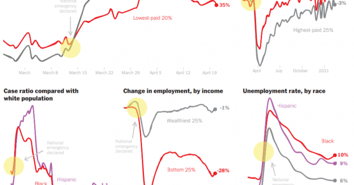
6. While most of the graphs included in this collection use data taken before the coronavirus pandemic hit, the graphs in this section (Graph V) represent changes during the pandemic. Choose one of the five smaller graphs and then answer the questions from the warm-up. What does the graph that you have selected reveal about changes in inequality during the pandemic?

Option 1: Pick a graph, any graph.

Pick any graph from the collection — either one you already looked at closely, or one that you didn’t — and click on the article link at the bottom of the graph. Read the article and then answer these questions:

  • What does the article reveal about inequality in the United States?

  • What role do the graphs embedded in the article serve? Do they make the article better? If you were the article’s editor, would you have made the decision to include the graphs? Why, or why not?

  • What additional questions do you have after reading the article?

Option 2: “The America We Need”

Many of the graphs included in this collection come from the 2020 Times Opinion series “The America We Need,” which explores how widening gaps in income, wealth and opportunity in the years before the coronavirus pandemic left everyone more vulnerable to the disease.

Read the introductory editorial written by The Times’s Editorial Board, and, while you read, choose three sentences or paragraphs that stand out to you. For each, write a response: Why did this excerpt catch your attention? What did you learn? What questions did it raise for you?

Option 3: Are chief executives paid too much?

In our related Student Opinion question, we invite you to weigh in on the question of whether the gap in compensation between executives and their employees is too wide. To answer the question, you’ll look closely at Graph D and read an article about how C.E.O. pay remains “stratospheric,” even at companies battered by the pandemic.

Are C.E.O.s Paid Too Much?

0
Are C.E.O.s Paid Too Much?

What do you notice about this graph? What do you wonder?

In “C.E.O. Pay Remains Stratospheric, Even at Companies Battered by Pandemic,” David Gelles writes that some of the same companies that laid off thousands of workers during the pandemic still paid their C.E.O.s handsomely:

Boeing had a historically bad 2020. Its 737 Max was grounded for most of the year after two deadly crashes, the pandemic decimated its business, and the company announced plans to lay off 30,000 workers and reported a $12 billion loss. Nonetheless, its chief executive, David Calhoun, was rewarded with some $21.1 million in compensation.

Norwegian Cruise Line barely survived the year. With the cruise industry at a standstill, the company lost $4 billion and furloughed 20 percent of its staff. That didn’t stop Norwegian from more than doubling the pay of Frank Del Rio, its chief executive, to $36.4 million.

And at Hilton, where nearly a quarter of the corporate staff were laid off as hotels around the world sat empty and the company lost $720 million, it was a good year for the man in charge. Hilton reported in a securities filing that Chris Nassetta, its chief executive, received compensation worth $55.9 million in 2020.

The coronavirus plunged the world into an economic crisis, sent the U.S. unemployment rate skyrocketing and left millions of Americans struggling to make ends meet. Yet at many of the companies hit hardest by the pandemic, the executives in charge were showered with riches.

The divergent fortunes of C.E.O.s and everyday workers illustrate the sharp divides in a nation on the precipice of an economic boom but still racked by steep income inequality. The stock markets are up and the wealthy are spending freely, but millions are still facing significant hardship. Executives are minting fortunes while laid-off workers line up at food banks.

The article continues:

The gap between executive compensation and average worker pay has been growing for decades. Chief executives of big companies now make, on average, 320 times as much as their typical worker, according to the Economic Policy Institute. In 1989, that ratio was 61 to 1. From 1978 to 2019, compensation grew 14 percent for typical workers. It rose 1,167 percent for C.E.O.s.

The pandemic only compounded these disparities, as hundreds of companies awarded their leaders pay packages worth significantly more than most Americans will make in their entire lives.

Students, read the entire article, then tell us:

  • Do C.E.O.s make too much money? Do you think their pay is too high relative to that of the average worker? Why or why not?

  • In your opinion, what factors should determine an employee’s pay? To what extent do you think there should there be differences in pay between workers? How big should those differences be, and upon what criteria should they be based?

  • Do you think executives who made more money during the pandemic were justified in doing so? Why or why not?

  • What do you know about how wealth is distributed in the United States? Do you think C.E.O. pay should be reconsidered in the context of stark wealth and income inequality and pay gaps along racial and gender lines? (For example, a 2020 New York Times review found that of the people at the top of the 25 highest-valued companies in the United States, only six are Asian or Black; all of them are men.)

  • Do you think income inequality is a problem? Why or why not? If so, do you think efforts to close the gap should focus on limiting the income of the highest-paid workers, increasing the income of the lowest-paid, or both?


About Student Opinion

• Find all of our Student Opinion questions in this column.
• Have an idea for a Student Opinion question? Tell us about it.
• Learn more about how to use our free daily writing prompts for remote learning.

Students 13 and older in the United States and the United Kingdom, and 16 and older elsewhere, are invited to comment. All comments are moderated by the Learning Network staff, but please keep in mind that once your comment is accepted, it will be made public.

6 go-to programming resources from the Codecademy community

0
6 go-to programming resources from the Codecademy community

Coding can be complicated. Whether you’re a novice programmer or an expert, it’s easy to get lost in all the elements, arrays, and selectors. Plus, with technology constantly evolving, it can be hard staying up to date. Thankfully, there’s a worldwide web filled with resources to help you along your way.

We turned to our community of learners and asked about their favorite programming resources. Here’s what they shared. Below, you’ll find six resources to turn to when you’re stuck on a coding problem or grappling with a new concept.

Google

If you haven’t already, you’ve probably heard a developer jokingly refer to themselves as a professional Googler. While exaggerated, the saying holds a tidbit of truth. Google is a valuable resource for programmers, and many coding problems can be solved with a simple search.

The next time you encounter an error in your code, try searching the error message on Google. You’ll likely be directed to a solution, possibly from one of the other resources listed below.

Stack Overflow

Having trouble finding a solution on Google? Try checking Stack Overflow, like this learner who struggled with dot notation while taking our Python course and received helpful explanations about the distinction between methods and functions.

Stack Overflow is a platform for developers to ask and answer questions about programming. The website is so popular that it receives over 100 million visitors every month. Reach out to a developer you know and ask them if they’ve heard of Stack Overflow. Chances are, they’ll have nothing but praise.

It’s also a great resource for esoteric questions. Wondering why HTML thinks Chuck Norris is a color? Find out here.

MDN Web Docs

MDN Web Docs is a digital encyclopedia of all things related to web technology, including programming languages like HTML, CSS, and JavaScript. Need help understanding a concept? Hop over to MDN for definitions, applications, reference materials, and more.

MDN also offers guides and tutorials for beginner, intermediate, and advanced programmers — along with several tools and resources for checking and optimizing your code.

Corey Schafer’s YouTube channel

Several learners offered Corey Schafer’s YouTube channel as their favorite programming resource. Corey Schafer is a developer who dedicated his channel to “creating tutorials and walkthroughs for software developers, programmers, and engineers.”

Corey’s channel serves as an excellent supplement to our courses, with educational videos on programming languages, libraries, and frameworks like SQL, Pandas, and Django. In some of his most popular videos, he teaches viewers how to set up a Python development environment and walks us through the basics of classes and object-oriented programming.

Darknet Diaries

You know what they say about all work and no play. Building your skills is great, but it’s important that we remember to give ourselves a break sometimes to avoid getting burned out — and what better way to relax than with an educational (yet entertaining) podcast?

Several learners recommended the Darknet Diaries. Created by Jack Rhysider, the investigative podcast tells “true stories from the dark side of the internet.” In between 30 and 90 minutes, you’ll hear captivating stories about cybercrime, hacking, and more. Their most recent episode covers The Pirate Bay, an online directory of famous copyrighted materials.

Pledged to journalistic integrity, the Darknet Diaries verifies the authenticity of all the information within their podcast in hopes of contributing to a better-informed populace. Their reporting has been critically acclaimed by organizations like The Guardian and The New York Times, and they also received the Shorty Industry Award for Best Podcast in Social Media.

Codecademy communities

Last but not least, multiple learners named Codecademy communities like our forums and Discord server as their favorite resource. Both communities are great places to engage and interact with other learners and even Codecademy team members.

Having trouble with one of our courses? Take a look through our communities. You’ll probably find other people who’ve come across a similar issue and found a solution. If not, share your problem on the forum. You’ll find a hoard of people who are more than happy to help. Plus, other learners might be going through the exact same thing, and your post could be just what they need.

Our forums are also a great place to get career advice from experts and professionals. Take this post as an example, where Codecademy community member Ehfaz Rezwan shares their insights from their decade of experience as a programmer, touching on the importance of mastering programming basics, data structures, and algorithms and using these skills to create real-world projects. Alternatively, you could read through our “Day in the Life” series, in which Codecademy team members share their experiences in various roles.

In another thread, community member Pablo Chois discusses the competencies he looks for while interviewing candidates as a Software Engineering Manager, such as familiarity with Command-Line and Git.

Hopefully, these resources will help the next time you’re struggling with a concept, stuck on a coding problem, or just need a break. Think we’re missing something from the list? Leave it in a comment below.

As Professors, New York Times Staff Members Teach, and Learn

0
As Professors, New York Times Staff Members Teach, and Learn

Times Insider explains who we are and what we do, and delivers behind-the-scenes insights into how our journalism comes together.

In 2017, after spending more than 13 years covering Iraq and China for The New York Times, Edward Wong returned to the United States and began teaching international reporting at Princeton University.

When he wasn’t filing articles about foreign policy and overseas events as a Times correspondent, he was trying to impart lessons from his experiences inside a war zone and the world’s largest authoritarian state. He also discovered that the students weren’t the only ones learning.

“Teaching the basics of journalism reminds me of what matters most in reporting and writing,” Mr. Wong said. “How to find compelling stories and tell them with truth and accuracy, how to ask the important questions, how to keep in mind a moral vision for our work.”

Across The Times, many journalists have divided their hours between the newsroom and the classroom, juggling deadlines with second jobs as professors, even during the pandemic. But the extra work is rewarding, they say.

“Both are professions of passion,” said Lara Jakes, a diplomatic correspondent based in Washington, who teaches a national security and foreign policy reporting course at Georgetown University. “We do them because we care about making an impact.”

Staff members teach more than reporting. Ari Isaacman Bevacqua has balanced media relations for The Times while teaching a course on audience development at George Washington University’s School of Media and Public Affairs. Marc Lacey, an assistant managing editor who oversees The Times’s live coverage of the news, recently led a virtual class about newsroom management at the University of California, Berkeley.

Teaching gives Times employees a chance to instill the tenets of journalism in the next generation, and it enables journalists to keep in touch with younger viewpoints and newer topics.

“The questions that I get from college students keep me on my toes as an editor,” Mr. Lacey said. “They ask ‘why’ a lot, and force me to explain my decision-making. They’re a great focus group for the challenging journalism calls we have to make every day.”

Journalists also get a chance to teach courses that delve more deeply into their fields of expertise.

Michael Kimmelman, an architecture critic and the founder of The Times’s Headway initiative, which examines global and national challenges, teaches “Cities and Climate Change” at the Columbia University Graduate School of Architecture, Planning and Preservation. Peter Applebome, a longtime editor and correspondent on the National desk, teaches “American Voices: Reporting From a Divided Country” at Duke University’s Sanford School of Public Policy.

Until classes went remote in the spring, Mr. Applebome flew weekly to Durham, N.C., to be with his students. But he still relied on video calls to include colleagues from Times bureaus across the country: “I taught by Zoom, with colleagues as guest speakers, before Zoom was Zoom,” he said.

Journalism and teaching are “a natural fit,” he added. “Journalists are always asking questions and trying to make sense of the world and communicate what they find to others. So do teachers.”

Samuel Freedman, who has taught at the Columbia University School of Journalism for three decades and has published nine books, wrote The Times’s “On Religion” column before his retirement in 2016. Teaching, he said, requires the reporter to codify their practices.

“Doing journalism can be situational to a fault,” he said. “But when you’re teaching nascent journalists, it behooves you to develop and almost formalize your own sense of ethics.”

Mr. Freedman, who teaches a seminar on book writing, seeks to build a community of journalists committed to reporting rigorously and writing with integrity and intentionality. Students have gone on to publish nearly 80 books originating in his classroom.

I took his course in 2015, and he guided us on, among other things, finding “color,” the details in a story that pull the reader into the moment. I carried his lessons with me when I began working as a freelance reporter for The Times a few months later.

Walt Bogdanich, a Times investigative reporter who has won three Pulitzer Prizes, teaches an investigative reporting course at Columbia University and reminds his students that journalism is “the opportunity to leave your mark on your neighborhood, your state, your nation and maybe even the world.”

Mr. Wong, who has worked in places without a free press, has the same mind-set and said that teaching involved encouraging students to “roll up their sleeves” and produce stories that make a difference.

“I want to give them an abiding appreciation of the role of journalism in the civic discourse of a democracy, and to see it as a viable vocation if they’re passionate about it,” he said. “It’s a calling.”